
Bionexo is the largest platform for requesting quotations and closing purchases of hospital supplies and materials in the health sector throughout Brazil.
Present in 4 Latin American countries, Bionexo is the largest company in the sector, serving more than 2 thousand customers who receive access to a community with more than 7 thousand suppliers.
Context
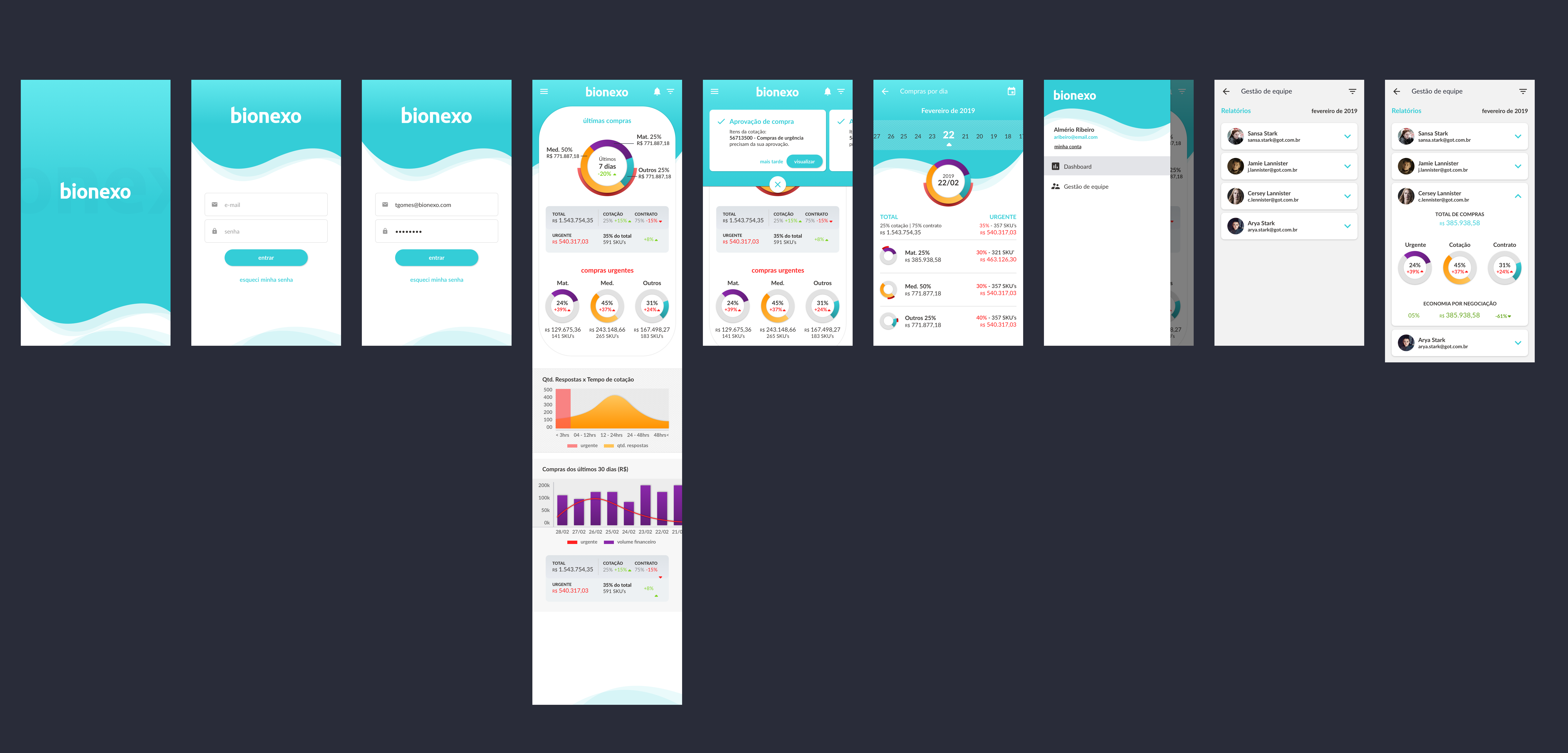
In 2019, the company was in the process of carrying out some feasibility studies on solutions to compose its portfolio and provide innovation on the bionexo platform. The board asked the UX and UI team for a quick study of a mobile version of the platform, intended for the hospital management public, to be presented to the board of investors.
Solution
In order to speed up the process and meet the demand, we decided to make a prototype navigable on invision, so that the product director could install it on his smartphone to present and share with interested members to live the experience of using the app.
We divided the roles between two people, with one professional dedicated to collecting the information that would be presented in the App and developing the UX and another – myself – focused on developing a visual identity for the app, applying the design to the generated wireframes and assembling the prototype navigable in invision.
Project's goal
– Discover which features were fundamental in the application;
– Develop a high-fidelity navigable prototype for presentation to the board of investors.
My role
Designer
Curiosity: One of the biggest difficulties that a purchasing team manager has in the hospital is to be able to measure whether their team is buying well and to evaluate the team's performance to optimize efforts. ;D
Design of Experience and Visual Identity
The idea was to bring a sense of innovation. We wanted whoever installed the app, upon opening it, could imagine a Bionexo that had existed for the last 20 years and a new Bionexo that was emerging. What we expected was to provoke a reaction of: “WOW, it feels like I entered a portal and am in a Bionexo from the future!“
“WOW, it feels like I entered a portal and am in a Bionexo from the future!“
Benchmark
I started a line of research for the design of apps that contained modern graphics. As our app would present a lot of information, the question was:
“What would be the best way and format to display this information? Both in a consolidated and detailed way, when necessary.”
I looked for apps on the market that brought these ideas coherently, elegantly and that conveyed the message of innovation.
Concept behind Visual Identity


I set out to bring a clean identity to the information areas, always keeping the main colors of the new brand identity in the background. The wave graphic represents the company's modernity, continuity and cycles.
It brought colors to the graphics that represent the other products of the company. The orange of the plannexo and the purple of the opmnexo. That way, if I were able to add these colors to the identity, in the future, when we started designing mobile solutions for these other products, we would have paved the way for a unique visual identity, without losing the originality of each brand.
To allude to modernity, of a forward-looking company, I also made a dark version dark of the app. To suit the taste of those who prefer the lowest light output and enjoy the cool and geek style of apps with dark mode.
The message of “Bionexo is innovating!” it was getting more and more clear. 😉
The final result


Time to relax
In the midst of this process, our carnival party took place. If we were already focusing on creativity and thinking about innovation, the day with everyone wearing costumes and “partying” brought even more the creative spirit to the composition of the material. 😀
